Studies show that consumers form a visual impression of a brand in under 50 milliseconds. In that fraction of a second, they decide whether you look credible, professional, and worth engaging with — or not. Yet many Indian small and medium businesses are unknowingly committing design mistakes that undermine trust before any conversation starts.
1. A Logo That Only Works at One Size
Your logo needs to work everywhere: a 16px favicon in a browser tab, a business card, a 6-foot banner, and a social media profile picture. Many DIY or low-cost logos are designed only for a specific size and become blurry, unreadable, or broken when scaled up or down.
The Fix: A professional logo should be delivered in vector formats (SVG, AI, EPS) that scale infinitely without quality loss. It should also have variations — a full logo, an icon-only version, and a horizontal layout — designed specifically for different use cases.
2. Too Many Fonts
Using four different typefaces across your website, brochures, and social media posts is one of the fastest ways to look unprofessional. Typography inconsistency signals that no one is paying attention to brand standards — which makes customers wonder what else you're not paying attention to.
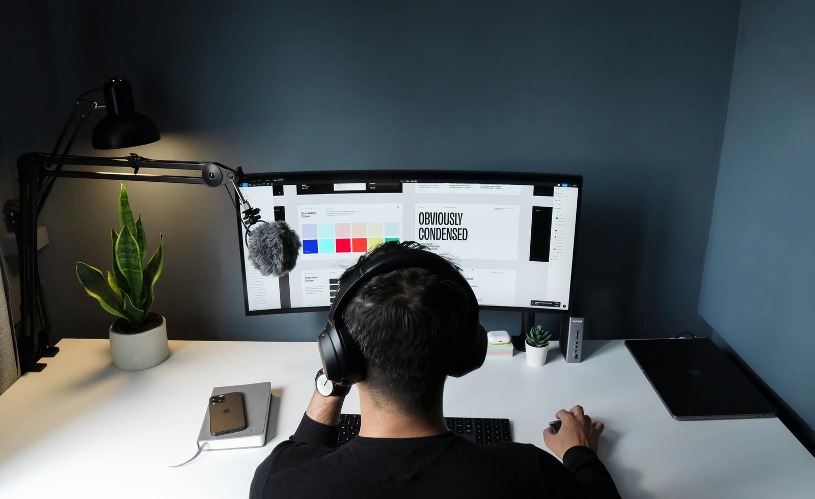
The Fix: Limit your brand to two font families maximum — typically one for headings and one for body text. Define them in a simple brand guide and apply them consistently across every touchpoint. Free, professional-quality fonts like Inter, Poppins, and Lato are excellent choices widely used by Indian brands.
"The brands that feel premium don't necessarily have more design — they have more consistency. Every touchpoint uses the same colours, the same fonts, the same visual language. That discipline is what builds trust over time."
3. Low-Resolution Images and Pixelated Graphics
Blurry images on a website or in a presentation tell the viewer one thing: this business doesn't care about quality. In an era of Retina displays and high-resolution smartphone screens, a pixelated image stands out immediately — and not in a good way.
The Fix: Use images that are at least 1920px wide for website hero sections. For print materials, source images at 300 DPI minimum. If you're using stock photography, invest in a reputable source. Avoid enlarging small images — downsizing is fine, upsizing creates blur.
4. Inconsistent Brand Colours Across Channels
Your logo uses navy blue. Your Instagram posts use a slightly different shade of blue. Your business cards have a third variation. To your audience, it subconsciously communicates that your brand is disorganised and lacks attention to detail.
The Fix: Define your exact brand colours using HEX codes (for digital), RGB values (for screen), and CMYK values (for print). A simple one-page brand style guide with these specifications ensures everyone — your designer, printer, social media manager, and developer — uses exactly the same colours every time.
5. Cluttered Designs With No Visual Hierarchy
Cramming every piece of information into a banner, brochure, or social post is a common mistake. When everything is emphasised, nothing is. The viewer's eye doesn't know where to start, the message gets lost, and the design looks amateurish regardless of how much effort went into it.
The Fix: Every piece of design should have one primary message and a clear visual hierarchy: the most important information biggest and boldest, secondary information smaller, supporting details smallest. Use white space aggressively — empty space is not wasted space; it's what gives important elements room to breathe and stand out.
6. Using Generic Clip Art or Free Icon Packs Incorrectly
Free icon packs and clip art libraries are used by thousands of businesses. When you use the same generic icons that a hundred other Indian SMEs use on their websites, your brand looks interchangeable and forgettable. Worse, mixing icons from different packs with inconsistent styles (some outlined, some filled, different weights) creates visual chaos.
The Fix: Either invest in a consistent, single icon set and use it throughout, or commission custom icons that are unique to your brand. If using free assets, choose one icon library and use it exclusively — never mix Flaticon, Font Awesome, and Google Icons on the same page.
7. Designing for Print, Not Digital — or Vice Versa
A design that looks great on a printed flyer may look terrible on a mobile screen — text too small, colours shifting, layout not adapting. Conversely, designs created for Instagram posts frequently fail when printed because they use RGB colour mode and 72 DPI resolution, which prints muddy and pixelated.
The Fix: Always specify the intended medium before your designer begins. Digital designs (websites, social media, digital ads) need RGB colour mode and appropriate resolution for screens. Print designs (flyers, banners, business cards) need CMYK colour mode and 300 DPI minimum. A professional designer handles these specifications automatically — a non-professional often doesn't know they exist.
8. No Brand Guide — Making Design Decisions Fresh Every Time
Without a brand guide, every new piece of communication — a social post, a new page on the website, a proposal document — becomes a fresh design decision. Over time, small variations accumulate into a brand that feels incoherent and inconsistent. New designers, new staff, or new vendors all interpret the brand differently.
The Fix: Even a simple 4–6 page brand guide covering your logo usage rules, colour palette, typography, and tone of voice transforms your brand consistency. It takes one day to create and saves hundreds of hours of rework over the years. Every business with ambitions to grow needs one.
The Business Cost of Poor Design
These aren't aesthetic concerns — they have direct business impact. A study by Stanford found that 75% of consumers judge a business's credibility by its visual design. In competitive Indian markets where customers have many choices, professional design is often the deciding factor between a lead contacting you or your competitor.
The good news: none of these mistakes are expensive to fix. A professional logo, a basic brand guide, and consistent design application across your key touchpoints can dramatically elevate how your business is perceived — and directly improve conversion rates.